
 614.224.6226
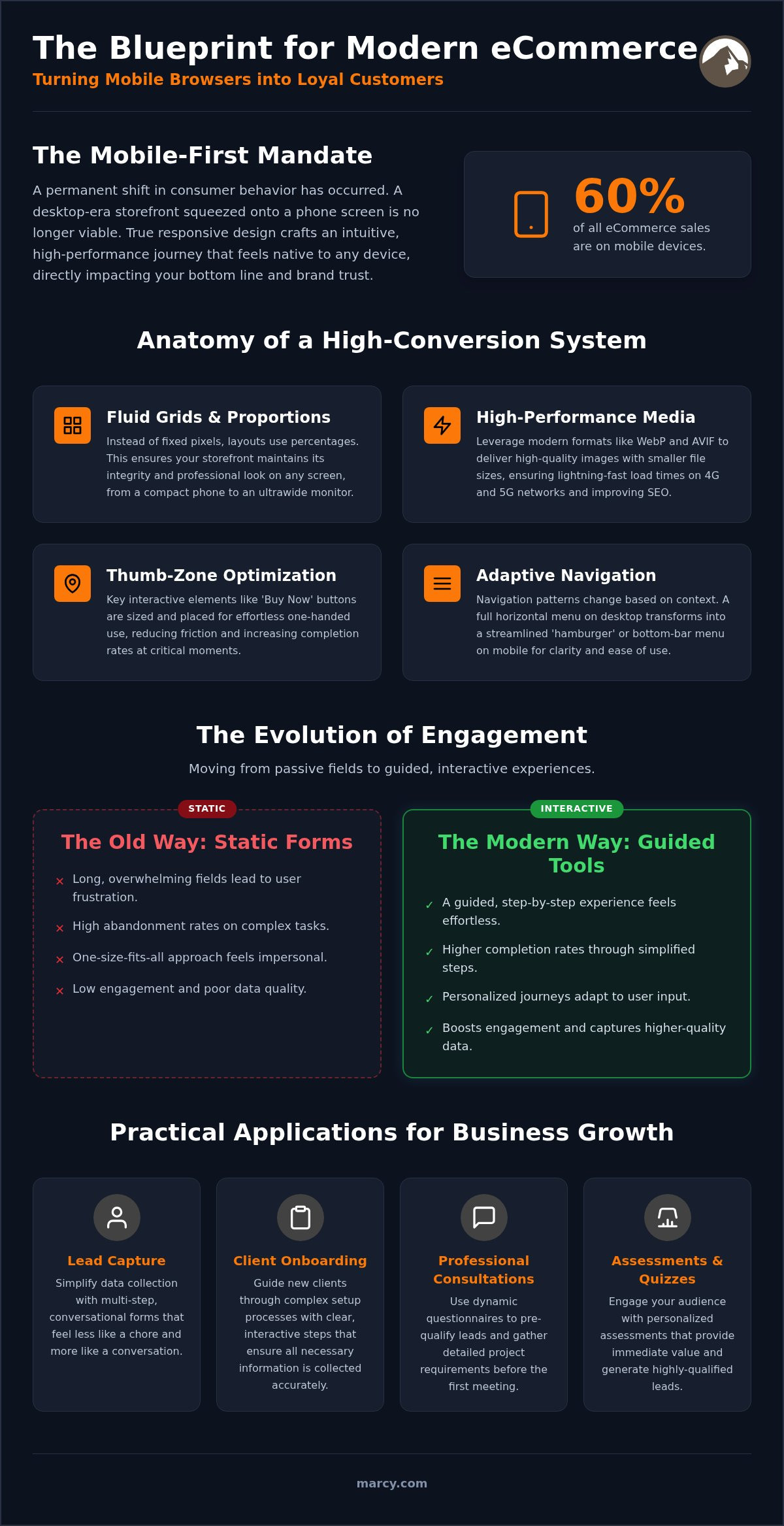
Mobile devices now drive 60% of all ecommerce sales worldwide. It is a staggering figure that confirms a permanent shift in how your customers shop. Yet, many brands still battle high cart abandonment and clunky navigation that frustrates users on 4G and 5G networks. If your storefront feels like a desktop site squeezed onto a small phone screen, you are losing revenue every second. True responsive ecommerce design is no longer just about resizing images. It is about crafting a high-performance journey that feels natural and intuitive on every device.
You deserve a digital storefront that works as hard as you do. This guide will help you master the principles of modern design to turn mobile browsers into loyal customers through strategic layouts. We will explore how to move beyond static fields toward interactive tools that simplify everything from lead capture to onboarding processes and professional consultations. You will learn to implement an experience-first approach that creates a seamless shopping journey and a future-proof presence. Let’s look at how a guided, interactive experience produces better results for your end-user.
Key Takeaways
- Move beyond fixed pixels to a fluid grid system that ensures your storefront adapts perfectly to every screen size.
- Leverage high-performance media formats like WebP and AVIF to maintain lightning-fast speeds on 4G and 5G networks.
- Master the transition from static content to interactive, guided shopping experiences that define modern responsive ecommerce design.
- Audit your existing mobile user journey to pinpoint friction and turn frustrated browsers into loyal customers.
- Discover how AI-powered solutions create the personalized, high-conversion environments necessary for 2026 retail success.
What is Responsive Ecommerce Design and Why Does it Matter in 2026?
Success in digital retail requires more than just a visible website. It demands a fluid system that adapts content and functionality to any device instantly. At its core, responsive ecommerce design is an architectural approach where your site’s layout, images, and navigation elements adjust proportionally based on the user’s screen size. This concept evolved from the broader practice of responsive web design; however, it carries much higher stakes for retail. In 2026, your customers expect a checkout process on a smartphone to be as effortless as it is on a desktop. If it isn’t, they will find a competitor who makes it easy.
The distinction between mobile-first and responsive design has sharpened significantly. Mobile-first is your strategy; it means you prioritize the handheld experience during the planning phase to ensure speed and simplicity. Responsive design is the technical execution that ensures your site remains high-performance across tablets, laptops, and even smart displays. Google’s mobile-first indexing now treats your mobile site as the primary version for ranking. If your mobile layout is a stripped-down, inferior version of your desktop store, your SEO performance will suffer. Modern retail also introduces “Adaptive Intent.” This means your site shouldn’t just resize. It should change based on how a user interacts. For example, a customer browsing on a train might need a prominent “Quick Buy” button, while a desktop user might prefer detailed technical specifications and larger galleries.
The Shift from Mobile-Friendly to Mobile-Optimized
Just fitting on the screen is no longer enough for the modern consumer. You need optimization. This involves thumb-zone mapping, where essential interactive elements are placed within easy reach of a user’s thumb. Professional website design also eliminates the need for separate mobile sites, which reduces your long-term maintenance costs. You manage one codebase, one set of product data, and one brand identity across every possible touchpoint. This creates a unified experience that builds authority.
The Business Case: ROI of a Seamless Experience
A seamless experience is your most effective weapon against cart abandonment. Data shows that mobile devices now drive 60% of all ecommerce sales worldwide, making performance a direct driver of your bottom line. For Columbus small businesses, professional design builds immediate brand trust. It signals that you are a modern, reliable entity ready to handle complex transactions. Responsive ecommerce design is essentially a 24/7 sales tool that never sleeps and never fails to provide a tailored shopping journey. Whether you are focusing on lead capture, onboarding processes, or professional consultations, a guided experience always produces better results than a static, traditional page.
The Anatomy of a High-Conversion Responsive Ecommerce System
A high-conversion store isn’t built on a fixed canvas. It’s a living, breathing system. To master responsive ecommerce design, you must move away from fixed pixel widths toward a fluid grid system. Pixels are static. Percentages are fluid. By using proportional layouts, your storefront maintains its integrity whether it’s viewed on a massive ultrawide monitor or a compact handheld device. This flexibility ensures that your brand message remains consistent and professional across every possible touchpoint.
Media queries act as the command center for this fluidity. Think of these as the technical instructions that tell your site how to behave on an iPhone vs. a Desktop. They allow us to hide unnecessary elements on small screens while expanding features on larger ones. This isn’t just about aesthetics; it’s about usability. For instance, every “Buy Now” button must undergo touch-target optimization. If a button is too small or too close to another link, you create friction. We ensure interactive elements are large enough for effortless tapping, which directly impacts your completion rates during critical moments like lead capture or onboarding processes.
Navigation Patterns for Mobile and Desktop
Navigation must evolve based on the user’s context. On a desktop, you might utilize a traditional horizontal menu with deep categorization. On mobile, the “Hamburger Menu” or a dedicated bottom-bar navigation becomes essential for one-handed use. We also implement breadcrumbs that guide the user without cluttering the limited screen space. The goal is to keep the checkout button visible at all times through the strategic use of “sticky” elements. The business logic behind responsive design for e-commerce suggests that every tap should lead the user closer to a sale without friction.
Performance Engineering: Speed as a Design Feature
Speed is not a luxury; it’s a core design feature. Data shows that 53% of mobile users leave a site that takes longer than 3 seconds to load. To combat this, we use flexible images and media in modern formats like WebP and AVIF. These formats provide high-resolution visuals at a fraction of the file size of traditional JPEGs. This technical precision is vital for meeting Google’s Core Web Vitals thresholds, which heavily influence your ecommerce search ranking. By integrating mobile responsive web design principles, we ensure your site remains lightning-fast on both 4G and 5G networks.
Whether you are designing a complex professional consultation portal or a simple product gallery, the focus must remain on the end-user. Interactive tools always outperform static fields by providing a guided, personalized experience. If you’re ready to see how these principles can transform your storefront, our website design specialists are ready to help you engineer a solution that scales.
Static vs. Interactive: The New Standard for Ecommerce Engagement
Traditional ecommerce relied on static product pages. These were essentially digital brochures. They were flat, unchanging, and often boring. In 2026, responsive ecommerce design has evolved into an interactive dialogue between the brand and the shopper. Instead of forcing a user to hunt for information, modern sites guide them through a tailored journey. This shift is critical. Engagement is the primary driver of long-term customer loyalty.
Personalization is the engine of this new standard. A truly responsive site adapts its content based on user history and geographic location. If a customer in Columbus is browsing for winter gear, the site should prioritize those items instantly. AI-powered chatbots and virtual assistants now play a vital role in the mobile environment. They provide immediate answers. This reduces the frustration that typically leads to cart abandonment. These tools don’t just sit there; they learn from every click. They turn a passive browsing session into an active, guided experience that feels tailored to the individual.
Lead Capture and Onboarding in a Responsive World
Forms that feel like work are conversion killers. We recommend a “one question at a time” approach for lead capture and onboarding processes. This method keeps the user focused. It reduces cognitive load by presenting information in bite-sized pieces. For example, a local Columbus retailer recently switched from a long, static sign-up form to an interactive assessment. The result? They tripled their lead volume in just one month. By asking engaging questions rather than demanding raw data, you build a relationship. For more on these strategies, explore our AI Powered Ecommerce Solutions to see how intelligence drives growth.
Professional Consultations and Assessments
For B2B companies, the “Contact Us” field is often a black hole. It provides no value to the user and little data for your team. Interactive tools for professional consultations and assessments change the game. They allow potential clients to self-qualify while receiving immediate value. A guided assessment can provide a personalized recommendation, a cost estimate, or a performance score. This makes the interaction feel like a professional consultation rather than a cold sales pitch. This approach produces better data for your marketing team. It allows you to segment your audience with surgical precision. You can then deliver follow-up marketing materials that actually resonate with their specific pain points. Interactive design ensures your site is a high-performance asset, not just a digital placeholder.
Implementing a Responsive Strategy: A Practical Reference for Businesses
Implementation isn’t just a technical task. It’s a strategic transformation. To achieve a high-performance responsive ecommerce design, you need a roadmap that prioritizes business outcomes over simple visual mockups. We approach every project with a strategy-first mindset. A beautiful site that doesn’t convert is a failed investment. You need a storefront that guides users through a seamless journey, regardless of the device they use.
Step 1: Audit your current mobile performance. Use your analytics to find exactly where users drop off. Are they abandoning carts on the shipping page or struggling with the menu? Step 2: Define your core user journeys. A lead capture path for a professional consultation looks very different from a direct purchase flow. You must design for both. Step 3: Develop a responsive design system. Instead of building individual pages, create a library of flexible, reusable components. Step 4: Test across real devices. Don’t rely only on desktop emulators. You need to feel how the site responds to physical touch on actual hardware. Step 5: Launch, monitor, and iterate. Use real user data to refine the experience and improve your completion rates constantly.
Testing Your Site Like a Professional
Professional testing goes beyond visual checks. We use tools like Google Search Console and BrowserStack to ensure compatibility across hundreds of device configurations. It’s also vital to perform “Throttling” tests. These simulate the slower 5G or 4G connections often found in specific Columbus neighborhoods. This ensures your site remains functional even when bandwidth is limited. If you’re managing complex data, such as B2B ecommerce web design tables, you must ensure they transform into readable cards or interactive elements on smaller screens to prevent user frustration.
Local Considerations for Columbus Brands
For Ohio businesses, local SEO and responsive design are inseparable. Google prioritizes sites that offer a fast, mobile-optimized experience for local searches. Integrating “Click to Call” buttons and interactive map features creates a seamless synergy between your digital storefront and your brick-and-mortar location. We view Web Design Columbus Ohio as the foundational pillar for any local growth strategy. It’s about being visible exactly where your customers are. This is usually on their phones while they’re on the move.
If you want to ensure your strategy is built for measurable results, our team is ready to guide you through a professional website design consultation today.
The Marcy Approach: Expert Responsive Ecommerce Solutions in Columbus
Choosing a partner for your digital transformation is a significant business decision. At Marcy Design, we bring nearly 40 years of experience to every project. Since 1986, we’ve helped brands navigate every major technological shift with confidence. Today, we combine that deep-rooted legacy with cutting-edge 2026 technology to deliver superior responsive ecommerce design. We don’t just build websites. We engineer results-driven platforms that prioritize business growth and user engagement. Our method centers on “Conversion-Centered Design.” While many agencies rely on simple visual tweaks, we integrate AI powered digital marketing solutions into the very fabric of your site. This allows for the high-level personalization and interactive experiences your customers now demand. Whether you need a guided onboarding process or a complex professional consultation tool, we ensure the technology serves your specific business goals. Being a local Columbus agency means we understand the Ohio market and are ready to provide the hands-on expertise your brand deserves.
Custom Development vs. Off-the-Shelf Templates
Off-the-shelf templates from platforms like Shopify or WooCommerce often fall short for scaling brands. They are designed for the masses. This means they lack the flexibility required for a truly unique brand voice. Our custom ecommerce website development in Columbus removes these limitations. We build systems that adapt to your workflow, not the other way around. This extends to your marketing materials, ensuring every digital touchpoint reflects the same quality and authority as your physical presence. Interactive tools always outperform static templates by providing a guided, personalized experience that produces better results for the end-user.
Ready to Modernize Your Digital Storefront?
It’s time to move beyond a static presence. Let’s transform your current site into a high-performance, responsive growth engine. We invite you to schedule a professional consultation to assess your current mobile performance and identify opportunities for improvement. Our team of specialists is ready to tackle your most complex challenges with high energy and proven strategy. We focus on achieving higher completion rates through engagement and personalization. Stop settling for a site that just fits on a screen. Start building a storefront that actively sells. Start your responsive journey with Marcy Design today and see how professional expertise turns browsers into loyal customers.
Future-Proof Your Digital Storefront Today
The digital retail landscape of 2026 demands more than just a presence. It requires a high-performance system that adapts to user intent instantly. You have seen how the shift from static pages to interactive, AI-driven journeys can transform your conversion rates. Whether you are optimizing for lead capture or complex onboarding, a strategic responsive ecommerce design ensures your brand remains competitive on every device. Performance engineering and fluid layouts are no longer optional features; they are the foundation of modern business growth.
Marcy Design has spent over 30 years mastering these technical shifts. As a veteran-owned agency with a deep-rooted connection to Columbus, we specialize in AI-integrated ecommerce growth that produces measurable results. We understand the mechanics of scaling a business in a fast-paced environment. It’s time to turn your website into a 24/7 sales tool that never fails to impress. Elevate your brand with a professional responsive ecommerce design from Marcy Design. Your path to a seamless, high-conversion shopping experience is ready for launch.
Frequently Asked Questions
What is the difference between responsive and adaptive ecommerce design?
Responsive design uses a single fluid layout that flows across all screen sizes using percentages and flexible grids. Adaptive design relies on several fixed layouts created for specific device breakpoints. While adaptive design can offer control, responsive ecommerce design is the professional standard because it future-proofs your site for any new device size that enters the market.
How much does a custom responsive ecommerce website cost in 2026?
The investment for a custom responsive site depends on your specific business requirements, the complexity of your product catalog, and the level of AI integration needed. Factors like interactive onboarding tools and professional consultation portals will influence the total scope of the project. We recommend focusing on the long-term ROI of a high-performance system rather than just the initial setup fee.
Will a responsive design improve my search engine rankings?
Yes, responsive ecommerce design is essential for high search engine rankings because Google primarily uses mobile-first indexing to evaluate your storefront. If your mobile experience is clunky or slow, your visibility in search results will suffer. A fast, seamless store signals to search engines that your brand provides a high-quality user experience, which directly improves your authority.
How long does it take to transition a static site to a responsive one?
The transition period depends on the size of your current storefront and the complexity of your data migrations. A standard project involves a thorough audit, user journey mapping, and rigorous testing across real devices to ensure performance. Most professional transformations are completed within a few months to ensure every interactive element is fully optimized for a successful launch.
Do I need a separate app if my ecommerce site is fully responsive?
Most brands don’t need a separate mobile app if their ecommerce site is fully responsive and high-performing. Modern web technology allows your site to behave like an app with features like “Add to Home Screen” and offline capabilities. Unless you require specific native hardware access, a single responsive site is more cost-effective and much easier for your team to maintain.
What are the most common responsive design mistakes to avoid?
Common mistakes include using tiny touch targets that are difficult to tap and unoptimized images that slow down mobile connections. Many businesses also fail to simplify their lead capture forms, which leads to high abandonment rates. Avoiding static, complex tables and replacing them with interactive, mobile-friendly components is a key step in building a professional, high-conversion storefront.
Can I update my own content on a responsive site without a developer?
You can absolutely update your own content if your site is built on a modern Content Management System (CMS). We prioritize user-friendly backends that allow you to manage product data and marketing materials without needing a developer for every change. This empowers your team to react quickly to market trends and seasonal shifts without technical delays.
How does responsive design handle large product catalogs and filtering?
Large catalogs are managed through off-canvas filtering and collapsible menus that keep the interface clean on small screens. We use lazy loading to ensure that product images only load as the user scrolls, which maintains high speeds across all devices. This approach makes browsing thousands of items feel as fast and intuitive as a single-product page, improving the overall guided experience.