
 614.224.6226
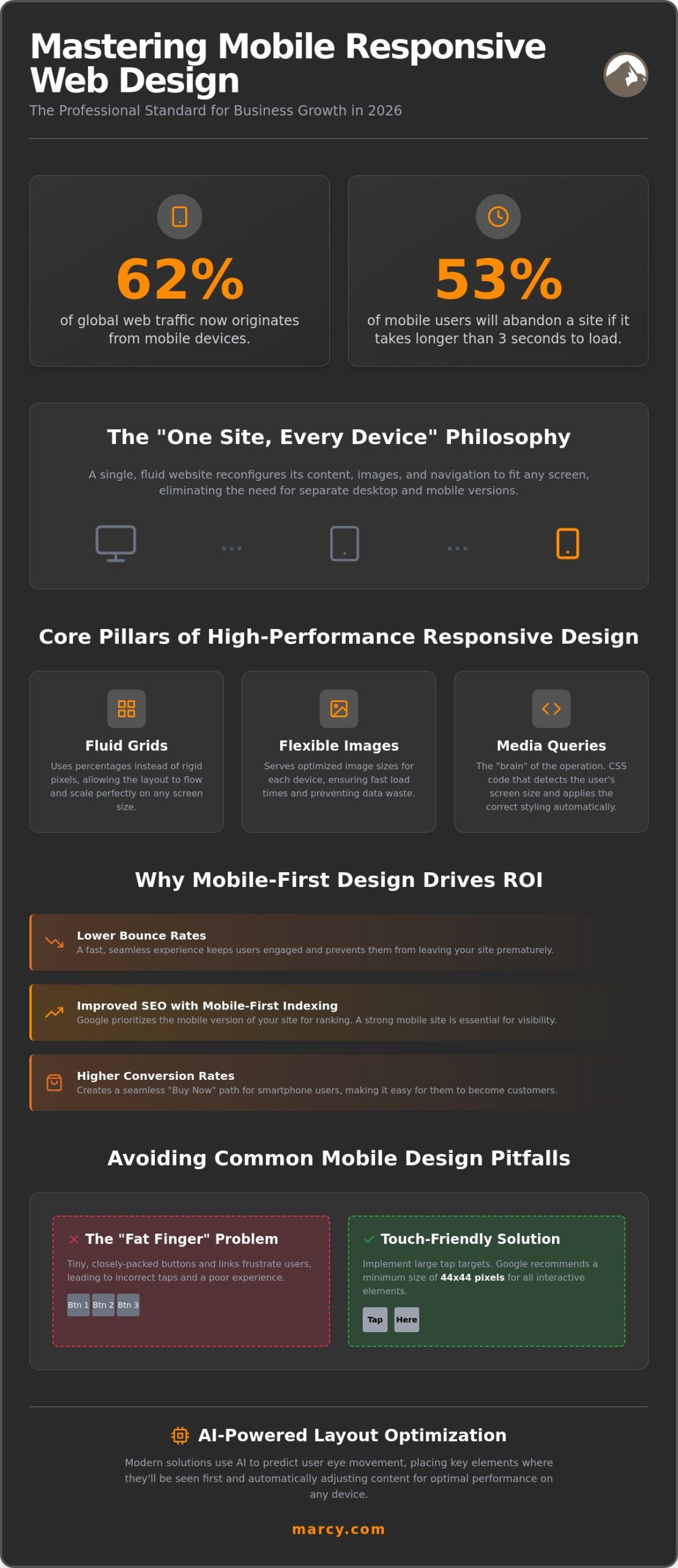
Did you know that over 62% of global web traffic now originates from mobile devices? If your site takes more than three seconds to load, 53% of those users will likely abandon your brand entirely. It’s a harsh reality for businesses struggling with high bounce rates and inconsistent digital identities. You likely recognize that a professional online presence is no longer optional; it’s the foundation of your credibility. This guide will help you master the essentials of mobile responsive web design to ensure your website converts every visitor, regardless of their device. We’ll examine the shift toward mobile-first indexing and the modern CSS techniques that will define the professional standard for 2026. From performance optimization to AI-driven frameworks, you’re about to discover how to turn mobile traffic into a reliable engine for business growth.
Key Takeaways
- Understand the “One Site, Every Device” philosophy that streamlines your digital presence and saves valuable business time.
- Learn to implement the core pillars of high-performance design, including fluid grids and flexible images that adapt to any screen size.
- Discover how mobile responsive web design drives ROI by lowering bounce rates and creating seamless “Buy Now” paths for smartphone users.
- Identify common mobile pitfalls, such as the “fat finger” problem, to ensure your site remains accessible and professional.
- See how Marcy Design combines four decades of industry experience with 2026 technology to elevate your brand’s mobile performance.
What is Mobile Responsive Web Design in the 2026 Landscape?
In 2026, your website is no longer a static brochure; it’s a dynamic asset that must adapt instantly to its environment. At its core, mobile responsive web design is a fluid approach to layout where a single website reconfigures its content, images, and navigation to fit the screen size of any device. This “One Site, Every Device” philosophy is a game changer for efficiency. It eliminates the need for maintaining separate desktop and mobile versions, which saves your business time and protects your brand integrity. We’ve moved far beyond the era of “m.dot” subdomains. Those outdated mobile-only sites often led to fragmented data and inconsistent user experiences. Today, a unified codebase ensures your message remains powerful whether it’s viewed on a massive desktop monitor or a compact smartphone. If you want to understand the technical foundations, you can explore What is Responsive Web Design? for a deep dive into fluid grids and flexible images. In this competitive year, simply “fitting” onto a screen isn’t enough. Your business must thrive by providing an experience that feels intentional and native to every user.
The Evolution from Desktop-First to Mobile-First
User behavior has undergone a radical transformation over the last decade. Mobile devices now account for over 62% of global web traffic as of early 2026. This shift wasn’t just a trend; it fundamentally changed how search engines operate. Google now uses Mobile-First Indexing as its primary standard. This means the search engine evaluates the mobile version of your content to determine your ranking. If your site is “desktop-only,” you’re essentially invisible to your target audience. For a local Columbus business, failing to prioritize the mobile experience is a digital death sentence. We’ve seen established brands lose significant market share because they ignored the device in their customer’s pocket.
Key Terminology Every Business Owner Should Know
You don’t need to be a developer to understand the mechanics of a high-performing site. Here are the essentials:
- Viewports: This is the user’s visible area of a web page. It changes based on the device width.
- Breakpoints: These are specific pixel widths where the website layout “breaks” and re-stacks content to look better on a different screen.
- CSS Media Queries: These are the instructions that detect a user’s device and apply the correct styling automatically.
- Touch-Friendly Design: Unlike “Click-Friendly” desktop sites, mobile sites must accommodate human fingers. Google recommends a minimum tap target size of 44×44 pixels to ensure users don’t get frustrated by tiny buttons.
Mastering these concepts allows you to communicate more effectively with your creative team. It ensures you’re building a tool that actually converts.
The Core Pillars of a High-Performance Responsive Website
Technical excellence isn’t accidental. It’s engineered. A successful mobile responsive web design relies on three technical foundations: fluid grids, flexible images, and media queries. Instead of rigid pixel measurements, we use percentages to create a layout that flows like water. This ensures your content scales perfectly across a 6-inch phone and a 30-inch monitor. You can explore the technical nuances of these Core Pillars of Responsive Design to see how modern CSS handles these transitions. Media queries act as the brain of this operation. They detect the user’s environment and trigger specific design rules, ensuring your brand looks professional whether the user is on a foldable phone or a standard tablet.
Speed is the ultimate metric for 2026. Data shows that 53% of mobile users abandon a site if it takes longer than three seconds to load. We prioritize Core Web Vitals, specifically Largest Contentful Paint, to ensure your site isn’t just pretty; it’s fast. Flexible images are critical here. We serve the right image size for the right device, preventing “blown-out” visuals that drain data and kill performance. Effective mobile responsive web design doesn’t just rearrange elements; it optimizes them for the reality of mobile hardware and connection speeds.
AI-Powered Layout Optimization
Innovation defines our process at Marcy Design. We use AI to predict user eye movement on mobile screens before a single line of code is written. This allows us to place your most important calls-to-action exactly where users look first. Our systems also utilize dynamic content adjustment. This means your site detects a device’s processing power and scales back heavy animations for older smartphones. Automated image compression ensures lightning-fast load times without sacrificing visual quality. If you’re ready to modernize your digital presence, our mobile web design services provide the competitive edge you need.
Navigation Strategies for Small Screens
Mobile navigation requires a different mindset. The “Hamburger Menu” remains a staple for secondary links, but “Tab Bars” at the bottom of the screen are gaining ground for high-frequency actions. We focus on the “Thumb-Zone.” All interactive elements must be easily reachable with a single hand. This includes maintaining a minimum touch target size of 44×44 pixels. We also simplify complex forms by using smart defaults and single-column layouts. Reducing the number of fields prevents user frustration and directly increases your conversion rates. Clarity is the key to mobile success.
Strategic Advantages: Why Mobile-First Design Drives ROI
Investing in mobile responsive web design is a strategic move that pays dividends across every marketing channel. It’s the difference between a visitor who bounces and a customer who converts. When a site adapts perfectly to a user’s device, engagement metrics soar. Seamless user experiences keep potential clients on your page longer, directly lowering your bounce rates. This isn’t just about looking good; it’s about building trust. A professional, consistent brand image across all screens signals to your audience that your business is reliable and forward-thinking. To achieve this level of precision, many developers follow Responsive Design Best Practices to ensure viewports and media queries are perfectly aligned. For Columbus businesses, this technical excellence translates to SEO dominance. Google prioritizes sites that offer superior mobile experiences, helping you climb to the top of local search results where your customers are actually looking.
Conversion is the ultimate goal. Mobile-first design makes it effortless for users to take action. Whether it’s a prominent “Call Us” button for a local service or a streamlined “Get a Quote” form, accessibility drives revenue. If your site feels clunky or requires pinching and zooming, you’re essentially handing your leads to the competition. We focus on removing friction at every touchpoint, ensuring your digital storefront is always open and easy to navigate. High-performance design isn’t a luxury. It’s a fundamental requirement for business growth in 2026.
Mobile Sales and the Ecommerce Revolution
The Ohio market has seen a massive surge in mobile-only shoppers. If you’re selling products online, your mobile site must be your best salesperson. This requires more than just a shrinking layout. It demands the integration of one-tap payment solutions like Apple Pay and Google Pay. These features eliminate the need for users to type in credit card numbers on a small screen, which significantly reduces cart abandonment. A non-responsive ecommerce site is a liability that actively stunts your growth. In 2026, if you aren’t optimized for the mobile shopper, you’re leaving money on the table.
The Social Media Connection
Your social media strategy is only as strong as your landing page. High-performing ads on Instagram or Facebook are wasted if the destination is a desktop-only nightmare. We create “Instagram-ready” layouts that maintain the visual energy of your social content while guiding users toward a clear objective. At Marcy Design, we synchronize your social media management with your mobile responsive web design. This synergy ensures that every click from a mobile app leads to a high-converting, responsive experience that reinforces your brand’s authority.
Avoiding Common Mobile Design Pitfalls for Business Owners
Many business owners assume they have a mobile responsive web design simply because their site fits on a smartphone screen. This is a dangerous misconception. A site that technically “fits” but remains functionally broken will drive customers directly to your competitors. One of the most frequent offenders is the “fat finger” problem. If your buttons are too small or packed too closely together, users will inevitably misclick. Google recommends a minimum touch target of 44×44 pixels. Ignoring this simple standard turns a routine visit into a frustrating ordeal. Clarity is profit. Your interface must be as intuitive as it is attractive.
Performance is the next hurdle. As we’ve established, users expect speed. The median mobile homepage weight reached 2,362 KB in July 2025, which is far too heavy for a fast-paced digital world. Slow load times remain the number one reason for mobile abandonment. If your site takes longer than three seconds to appear, you’ve already lost half your audience. Similarly, non-responsive pop-ups are a conversion death sentence. If a user don’t find the “X” to close an intrusive ad on their phone, they won’t struggle; they’ll leave. Don’t let “interruptive” design destroy your hard-earned traffic.
Technical Debt and Outdated Templates
Relying on a five-year-old “responsive” template is a significant risk. Web standards move fast. Off-the-shelf solutions often come bloated with unnecessary code that fails the speed test. Technical debt accumulates in non-optimized code, creating a sluggish experience that becomes harder and more expensive to fix over time. You need a lean, purpose-built framework to maintain a competitive edge. If your current site feels heavy, it’s time for a change. Contact us for a professional website design audit to identify these hidden performance killers.
Testing Your Site Like a Pro
Simulators on a desktop computer are helpful, but they aren’t enough. You must test your site on real devices to understand the true user experience. A simulator won’t show you how sunlight glare or a 3-year-old processor affects your site’s usability. Follow this three-point audit to gauge your current status:
- Run Google’s Mobile-Friendly Test: This provides a baseline for how search engines see your site.
- Check Touch Targets: Ensure every link and button is easily clickable with a thumb.
- Audit Content Visibility: Verify that vital information, like your phone number and address, isn’t accidentally hidden on mobile views.
True responsiveness requires constant vigilance and professional expertise. Don’t settle for “good enough” when your business growth is on the line.
Elevating Your Brand with Marcy Design’s Mobile Solutions
Experience matters in a world of fleeting digital trends. At Marcy Design, we’ve spent 40 years mastering the evolution of business communication, and we’ve done it right here in Columbus. We blend that deep-rooted legacy with 2026 technology to provide a competitive edge that generic agencies simply can’t match. Our Columbus-based team understands the local Ohio business landscape because we live and work here. We don’t rely on restrictive, off-the-shelf templates. Instead, we deliver customized mobile responsive web design that reflects your unique brand identity and speaks directly to your target audience. You need a partner that treats your digital presence as a strategic asset, not just a line item.
Innovation is our standard. We don’t just build sites; we integrate AI-powered marketing and advertising campaigns directly into your mobile-responsive framework. This ensures that every visitor experience is optimized for conversion from the first second they land on your page. We utilize AI-powered solutions to analyze user behavior and refine your layouts in real-time. This results in a high-performance site that scales with your ambition. Whether you need complex ecommerce solutions or high-impact marketing materials, our team is ready to tackle your most difficult challenges with high energy and professional precision.
The Marcy Design Process: From Vision to Conversion
Our strategic approach to mobile-responsive architecture begins with your business goals. We don’t start with code; we start with a consultation to understand your vision. This collaborative design process ensures that your brand identity remains consistent across every device. We focus on building a lean, fast, and accessible infrastructure that search engines love. Beyond the initial launch, we offer social media management and managed advertising to scale your presence effectively. We’re here for the long haul, providing the stability and innovation required to maintain your market leadership.
Ready to Modernize Your Digital Presence?
Your mobile performance is your digital reputation. If your site feels like a relic of the past, you’re losing credibility with every click. Now is the perfect time to audit your current performance and identify where you’re leaving money on the table. A professional design partnership offers long-term value, transforming your website from a passive brochure into a proactive sales tool. Don’t let your competition outpace you in the mobile arena. It’s time to act decisively. Contact Marcy Design for a Mobile Audit and discover how we can elevate your brand for the 2026 standard.
Secure Your Competitive Edge in the 2026 Digital Market
The shift toward mobile dominance is no longer a prediction; it’s the current reality for every Ohio business. High-performance mobile responsive web design is the foundation of your visibility and conversion potential. By prioritizing fluid grids, lightning-fast load times, and thumb-friendly navigation, you ensure your brand remains professional on every screen. We’ve explored how technical debt and outdated templates can sabotage your growth. Now is the time to transition toward a modern, AI-integrated framework that works as hard as you do. As strategic advertising and brand management specialists, we understand how to turn technical excellence into measurable ROI. Marcy Design has been a trusted, Columbus-based partner since 1986, offering unmatched expertise in AI-powered ecommerce and web solutions. You don’t have to navigate these technological shifts alone. Our dedicated team is ready to help you tackle complex challenges and transform your digital presence. Scale Your Business with Professional Web Design from Marcy Design today. The future of your brand starts with a single, responsive step.
Frequently Asked Questions
Is mobile responsive design the same as a mobile app?
No, mobile responsive design is not the same as a mobile app. A responsive website is accessed through a web browser and adjusts its layout automatically to any screen size. Mobile apps are standalone software that users must download and install on their devices. While apps offer specific features like push notifications, a responsive site ensures your brand is accessible to anyone with a URL without requiring a download.
How much does a mobile responsive website cost for a Columbus business?
The investment for a responsive website depends entirely on the complexity of your business needs and the depth of integration required. While simple sites require fewer resources, custom enterprise solutions with AI features or complex ecommerce functionality involve a more significant scope. We recommend a professional consultation to determine your specific requirements. This ensures your budget is allocated toward features that drive actual business growth.
Will a responsive design improve my Google search ranking?
Yes, mobile responsive web design is a critical factor for improving your search engine rankings. Google primarily uses the mobile version of a site for indexing and ranking as of early 2026. If your site isn’t optimized for mobile, you’ll likely see a decline in visibility. A responsive layout also improves user engagement metrics, which signals to Google that your site provides high value to visitors.
Do I need a separate website for mobile users in 2026?
No, you don’t need a separate mobile website in the modern digital environment. The “One Site, Every Device” philosophy is the professional standard because it’s more efficient to maintain and superior for SEO. Maintaining a separate “m.dot” site often leads to fragmented data and inconsistent branding. A single, responsive codebase ensures your message remains unified and professional across all platforms.
How long does it take to convert a desktop site to a responsive design?
The timeline for converting a desktop site to a responsive design varies based on the existing architecture and content volume. A standard conversion might take several weeks, while a full redesign of a complex ecommerce platform can take several months. We focus on a methodical transition that prioritizes your core business functions. This ensures your site remains operational while we upgrade the underlying framework to modern standards.
What is the difference between responsive and adaptive web design?
Responsive design uses fluid grids and percentages to adapt to any screen size, while adaptive design uses fixed layouts for specific device widths. Responsive design is generally preferred because it’s more future-proof. It handles new device sizes, like foldables or ultra-wide monitors, without requiring additional code. Adaptive design is more rigid and often requires more maintenance as mobile hardware continues to evolve.
Can I make my current WordPress site mobile responsive?
Yes, you can make an existing WordPress site responsive by updating your theme or implementing custom CSS. However, simply switching themes often isn’t enough to solve deep performance issues or broken user flows. Professional development ensures that your plugins, forms, and custom content blocks function perfectly on every device. We specialize in optimizing WordPress environments to meet the high standards of mobile responsive web design.
Why is my website slow on mobile but fast on desktop?
Mobile devices often struggle with heavy assets that a desktop handles with ease due to differences in processing power and connection stability. If your site is slow on smartphones, it’s likely due to unoptimized images, excessive JavaScript, or a lack of mobile-specific caching. Data shows that 53% of mobile users will abandon a site if it takes more than three seconds to load. Optimizing for mobile requires a lean approach to code management.