
 614.224.6226
A nonprofit donation page works when a motivated visitor can understand the cause, choose an amount, pay and get a receipt in one uninterrupted flow, on a phone, without second-guessing whether the page is safe. Everything else is detail. That detail is where most pages lose gifts, and it is mostly design and development work: layout, form logic, speed, accessibility and the way the page connects to the rest of your site. At Marcy Design, our nonprofit website services start from that point of view.
TL;DR
- A donation page has one job: finish the gift. Remove menus, side offers and extra screens that pull donors away from the form.
- Ask only for what you need to take payment and send a receipt, usually name, email and payment details.
- Offer three or four suggested amounts plus Other, make one-time and monthly giving equally easy to see, and explain what a gift does.
- Show trust signals beside the button: HTTPS, your legal name, EIN, contact details, privacy policy and where the money goes.
- Design for thumbs and for assistive technology, then keep measuring one change at a time.
Table of Contents
- What a donation page is supposed to do
- The impact case: say what a gift does
- Form design: fewer fields, fewer decisions
- Trust signals that belong next to the button
- Mobile and accessibility are part of the design brief
- Putting it together: a page layout that works
- Measure, then improve one thing at a time
- Where the donation page fits in your wider website
- Our perspective
- How Marcy Design helps nonprofits
- FAQ
- Sources
What a donation page is supposed to do
A donation page is a dedicated page where supporters make an online gift. It typically combines a donation form, a short statement of your mission and impact, and one-time or recurring giving options, as Funraise describes it. Its measure of success is simple: how many of the people who arrive become donors.
That is why a donation page is not a miniature version of your homepage. Your homepage serves volunteers, clients, funders, journalists and donors. The donation page serves one person at one moment: someone who has already decided to care. Your job is to protect that decision. Every extra link, banner, pop-up or required field is a chance for the donor to drift.
Think of the page in three parts:
- The reason. A headline and a few lines that make the impact concrete.
- The action. A short form with amounts, frequency and payment.
- The reassurance. Evidence that the organization is real, the payment is secure and the money will be used as described.
The rest of this guide goes through each part, then mobile and accessibility, then how to tell whether the page is actually working.
The impact case: say what a gift does
Donors rarely need your full history at this stage. They need one clear sentence about what their money accomplishes, placed above or beside the form. Specific beats general: “$50 provides a week of hot meals for a family of four” does more than “Your gift makes a difference.”
A few practical rules:
- Lead with a headline that matches the ask. If a donor clicked an email about winter shelter, the page should say winter shelter, not a generic “Donate” banner.
- Use one strong photo of the people or place you serve, not a gallery. Keep file sizes small so the page loads quickly on mobile data.
- Tie amounts to outcomes only where the numbers are true and current. Out-of-date impact figures damage trust faster than having none.
- Put a short impact line near the button. Some published conversion work reports gains from impact-oriented copy placed just below the donate button, which is where a hesitating donor looks last.
Keep this section to a short paragraph and perhaps three bullet points. If the page needs a long story, link the story from the confirmation page or an email afterward, not from the form.
Form design: fewer fields, fewer decisions
The form is where intent turns into revenue, and it is where over-collection hurts most. A good baseline, echoed across fundraising guidance, is to require name, email and payment information, and to ask for a mailing address only if you need one, for example to mail a printed receipt or a premium. Anything else can be collected after the gift, on the thank-you page or in a follow-up email.

Suggested amounts
Show three or four suggested amounts and an Other field. More choices create more decisions. Set the amounts from your own giving history: look at your median gift and your most common gift, then place amounts around them. Label the amounts with the impact they fund when you can.
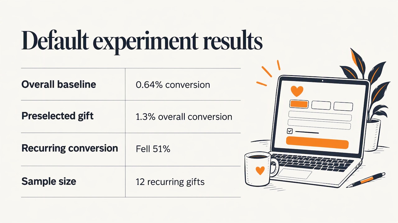
Be careful with preselected defaults. A published experiment on preselecting a monthly gift and amount found that overall conversion rose from 0.64% to 1.3%, while recurring conversion fell 51%, and the sample had only 12 recurring gifts. The lesson is not that defaults are good or bad. It is that a single headline number can hide what happened to the gifts you care about most.
One-time and monthly giving
Offer both, and make both visible. A simple toggle at the top of the form, labeled “One-time” and “Monthly,” works on small screens. Then:
- State clearly what a monthly gift means: the amount, the day it is charged, and how a donor can pause, change or cancel.
- Give a one-sentence reason to give monthly, such as what a steady gift lets you plan for.
- Do not hide one-time giving to push recurring. Donors who cannot find the option they want leave.
- Let the form’s button name the action, for example “Give $25 monthly” or “Give $100 today,” so there are no surprises at checkout.
Payment options
Cards are the baseline. Digital wallets such as Apple Pay and Google Pay shorten checkout on phones because they fill in name, email and card details in one tap. PayPal and Venmo are common additions for donors who prefer them. Which of these you can offer depends on how your site and payment processor are built, which is a good reason to settle the payment approach before the design is finalized, not after.
Keep the donor on the page
A donor should not hit a menu bar, a newsletter pop-up, a “Shop our merch” banner or a link that opens a new tab. Where possible, the entire gift should happen on a page that looks and sounds like your organization, with your logo and colors, so the donor never wonders whether they have landed somewhere else. Skip sending donors through intermediate screens before they reach the form, and save social sharing for the confirmation page, after the gift is complete.
This is the same discipline we apply to checkout flows in commerce. If it helps to see the logic, our piece on checkout optimization covers how last-step friction costs conversions, and the principles transfer directly to giving forms.
Trust signals that belong next to the button
Giving online means handing over card details to an organization the donor may only know through an email. Reassurance has to be visible exactly where the doubt arises, beside the form, not buried in the footer.
- Secure connection. Your page should load over HTTPS, and secure payment cues should sit near the payment fields.
- Who you are. Show your legal name, your tax-exempt status, your EIN, a mailing address and a way to reach a person.
- Privacy. Link a plain-language privacy policy and say you will not sell donor data, if that is your policy.
- Where the money goes. One or two lines on how gifts are used. If your state requires solicitation disclosures, include them.
- Consistent branding. A page that looks like the rest of your site feels safer than one that looks bolted on.
Receipts and what the IRS expects
For US donors, receipts are not optional courtesy. IRS guidance in Publication 1771 explains that donors need a bank record or written acknowledgment for contributions, and that a single contribution of $250 or more requires a written acknowledgment from the charity before the donor claims a deduction. Build your confirmation email so it includes your organization’s legal name, the amount and the date, and send it immediately. Have your accountant or tax adviser confirm the exact wording for your situation, especially if a donor receives anything in return for a gift.
The confirmation page
The moment after payment is when a donor feels most connected to you. Use it. Show a thank-you with the amount and a reference number, confirm that a receipt is on its way, offer a share button, and suggest one next step such as joining your email list, volunteering or attending an event. This is also the right place to ask for optional details you left off the form.
Mobile and accessibility are part of the design brief
A large share of nonprofit website traffic arrives on phones, and a donation page that is merely “responsive” can still be painful to use. Design the mobile view first, then scale up.
Mobile checklist
- Single-column layout with the form visible without much scrolling.
- Large tap targets for amounts, the frequency toggle and the donate button.
- Numeric keyboards for amount and card fields, and browser autofill enabled.
- No pop-ups and no horizontal scrolling.
- Compressed images and a fast load. Slow pages lose donors before they see the form.
- A real check on at least one iPhone and one Android phone before every campaign launch.
Our guides on mobile-optimized web solutions and on whether your site is mobile ready go deeper on the build side.
Accessibility checklist
An inaccessible donation form quietly excludes donors who use screen readers, keyboard navigation, magnification or voice control. The standard most organizations follow is the Web Content Accessibility Guidelines. The WCAG 2.2 quick reference lists the success criteria, including the minimum text contrast requirement. In practice, for a donation form that means:
- Visible labels on every field, placed outside the field, not only as placeholder text that disappears when typing.
- Plain-language error messages next to the field that needs fixing.
- A logical tab order, so a keyboard user moves through amount, frequency, details and payment in sequence.
- Enough contrast between text and background, and no reliance on color alone to show a selected amount or an error.
- Alt text on meaningful images and captions on any video.
- Text that can be zoomed without breaking the layout.
- No session timeout that wipes the form while someone is still filling it out.
Accessibility is also a sound business habit: the same changes that help a screen-reader user, such as clear labels and logical order, tend to make forms easier for everyone.
Putting it together: a page layout that works
A reliable top-to-bottom structure for a campaign or general giving page looks like this:
| Section | What goes there | Why |
|---|---|---|
| Headline and short impact text | One sentence on the cause, one on what a gift does | Confirms the donor is in the right place |
| Frequency toggle | One-time or Monthly | Makes recurring giving visible without hiding one-time |
| Amount buttons | Three or four amounts plus Other | Reduces decisions |
| Donor details | Name, email | Only what you need to send a receipt |
| Payment | Card, plus wallets if supported | Shortens checkout on phones |
| Donate button | Names the amount and frequency | No surprises |
| Trust block | HTTPS cue, legal name, EIN, contact, privacy link | Reassures at the moment of doubt |
| Impact line under the button | Short, specific outcome | Gives a last nudge |
Notice what is missing: no top navigation, no social feeds, no secondary offers. If your brand needs the logo to link home, keep it, but strip everything else.
Measure, then improve one thing at a time
A donation page is never finished. Donor behavior shifts with seasons, campaigns and traffic sources, so the page needs regular review. A workable routine:
- Pick one question. For example, does a shorter form raise completed gifts?
- Change one variable. Amounts, form length, button wording, payment options or trust placement, but not all at once.
- Track more than the total conversion rate. Watch recurring sign-ups and average gift size too. The preselection experiment above shows how a higher overall rate can come with fewer monthly donors.
- Segment by device. A change that helps on desktop can hurt on mobile.
- Give it enough traffic. Small samples, like the dozen recurring gifts in that experiment, can mislead.
Our broader guide to improving website conversion rate lays out how to prioritize this kind of work across a whole site, not just one page.
Where the donation page fits in your wider website
Most donors do not land on the donation page cold. They arrive from a story on your site, an email, a social post or a search. That means the page is only as strong as the path leading to it.
- Make the donate button findable. One consistent button in the header and in the footer, plus contextual calls to action inside stories and program pages.
- Match the promise. Pages that send traffic to the form should use the same wording, imagery and campaign name the donor just saw.
- Make the site discoverable. Donors often search for your organization by name or for your cause locally. Clear page titles, fast loading and sound structure help, and our overview of why SEO is a vital part of web design explains how those pieces fit.
- Keep hosting and performance steady during appeal periods such as year-end, when traffic can spike.
Our perspective
A donation page looks like a small design job, and that is exactly why it gets underbuilt. It sits where branding, user experience, accessibility, development and search meet, and a weak link in any of them costs gifts.
After more than 38 years in business, we keep coming back to the same principle: the design is there to serve the person using it. For a donor, that means a page that loads fast, speaks in your voice, works with a thumb and a screen reader, and never makes them wonder where their money went.
We also think the donation page should be built as part of the site, not stuck onto it. When the page, the stories that lead to it and the confirmation that follows are designed together, the donor experiences one organization, not three disconnected screens.
Greg
How Marcy Design helps nonprofits
Marcy Design is a Columbus, Ohio web design and marketing agency with more than 38 years in business and over 230 awards. We offer specialized website services for nonprofit organizations, along with custom website design, web development, web applications, accessibility, hosting and SEO. If your donation page needs to look like your organization, work on every device and sit inside a site that donors can find, that combination is what we do.
If you are planning a new site or a rebuild of your giving experience, you can see the full range on our services page or start a conversation through marcy.com.
FAQ
How many fields should a nonprofit donation form have?
As few as it takes to process the gift and send a receipt. For most organizations that is name, email and payment details. Ask for a mailing address only when you genuinely need it, and collect anything else after the gift, on the confirmation page or by email.
How many suggested gift amounts should I show?
Three or four, plus an Other field. Base them on your own median and most common gift, and tie each to a concrete outcome when the figures are accurate. Review them periodically, because donor behavior changes with campaigns and seasons.
Should I make monthly giving the default?
Offer monthly giving prominently, explain why it helps, and keep one-time giving just as easy to find. Defaulting everyone to a recurring gift can backfire, and the preselection experiment cited above shows overall conversion and recurring conversion can move in opposite directions. Measure both before you decide.
What does the IRS require for donation receipts?
For a single contribution of $250 or more, a donor needs a written acknowledgment from the charity before claiming a federal deduction, according to IRS Publication 1771. Send the acknowledgment automatically after each gift, and ask your accountant to confirm the wording, especially when donors receive goods or services in return.
How do I make a donation page accessible?
Follow the WCAG success criteria: visible field labels, plain-language errors, logical keyboard order, sufficient contrast, alt text, captions and zoom support. The WCAG 2.2 quick reference lists each requirement. Build these in from the start, since retrofitting a finished form is slower and costlier.
Sources
- Funraise: Donation Pages
- NextAfter: How pre-selecting a monthly gift and amount impacts conversions
- IRS Publication 1771: Charitable Contributions, Substantiation and Disclosure Requirements
- W3C: How to Meet WCAG 2.2 (Quick Reference)