
 614.224.6226
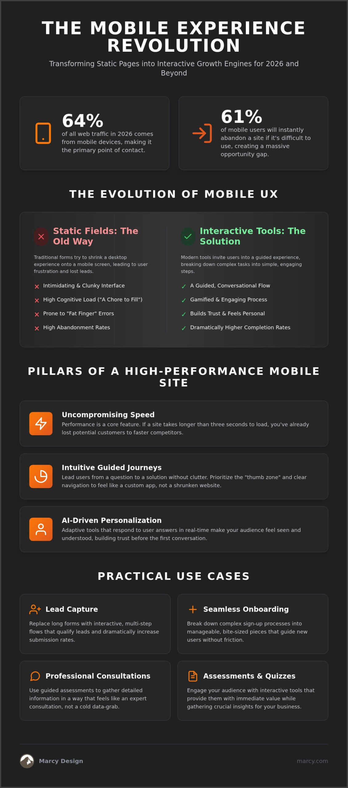
Did you know that 61% of mobile users will instantly abandon a site if it’s difficult to use, even though mobile devices now account for 64% of all web traffic in 2026? It’s a staggering gap. For many Columbus business owners, optimization often feels like a losing battle against technical jargon and forms that are impossible to navigate on a small screen. You’ve likely felt the frustration of watching potential leads vanish because your mobile site felt static and unresponsive. We understand that frustration. Since 1986, Marcy Design has helped local brands bridge the gap between simple visibility and true digital authority.
It’s time to stop settling for a site that just fits the screen. You deserve mobile optimized web solutions that actually drive growth. In this guide, you’ll discover how to transform static pages into interactive engines that capture leads and scale your operations. We’ll show you why guided experiences, such as interactive onboarding and professional assessments, outperform traditional forms every time. We’re moving beyond basic readability to create a competitive edge for your Columbus business with a site that feels like a custom app.
Key Takeaways
- Transform your digital presence by treating mobile optimized web solutions as a strategic growth engine rather than just a technical requirement.
- Replace frustrating static forms with interactive assessments and guided consultations to dramatically improve lead completion rates.
- Master the technical pillars of speed, accessibility, and AI-driven personalization to give your mobile site the high-performance feel of a custom app.
- Explore practical use cases for seamless onboarding and lead capture that eliminate friction for your mobile users.
- Gain a competitive edge in Columbus by blending Marcy Design’s decades of expertise with cutting-edge 2026 mobile technology.
Why Mobile Optimization is the 2026 Standard for Columbus Businesses
In 2026, thinking of mobile as a secondary screen is a recipe for irrelevance. Mobile optimized web solutions aren’t just a technical checklist; they’re a high-stakes business asset. With mobile devices accounting for 64% of global web traffic, your digital presence is likely the first point of contact for your customers. But here’s the catch: 61% of users will abandon a site that isn’t mobile-friendly. They aren’t just looking for information. They’re looking for an immediate, frictionless solution to their problems. You can’t afford to be the business that makes them wait.
The evolution of the mobile web has fundamentally shifted user psychology. In Columbus, where the local market is increasingly competitive, your neighbors aren’t just browsing; they’re deciding. If your site takes longer than three seconds to load, you’ve likely lost them to a faster competitor. Performance is now a core feature, not an afterthought. Users want answers in seconds, not minutes. If you can’t provide that speed, you’re essentially handing your leads to the business across the street.
The Move from Mobile-Friendly to Mobile-First
There’s a massive difference between a site that “works” on a phone and one built specifically for it. A mobile-friendly site might shrink its text to fit, but a mobile-first site prioritizes the “thumb zone” and interactive navigation. Google’s 2026 algorithms have evolved to prioritize deep user engagement over simple responsiveness. They look for “guided experiences,” which are journeys that lead a user from a question to a solution without the clutter of a desktop interface. This approach ensures your mobile optimized web solutions feel intuitive rather than restrictive.
Economic Impact for Local Brands
Investing in high-performance mobile UX directly impacts your bottom line by reducing customer acquisition costs (CAC). When a mobile site feels like a custom app, completion rates for lead capture and onboarding processes skyrocket. This builds local brand authority. People trust businesses that respect their time and provide a seamless digital experience. Since 1986, the team at Marcy Design has understood this connection between technology and growth. We help Columbus brands scale by ensuring their first impression on a smartphone is a professional one.
Static Fields vs. Interactive Tools: The Evolution of Mobile UX
Most mobile sites fail because they try to force a desktop experience onto a five-inch screen. Traditional contact forms are the biggest culprit. They’re clunky. They’re intimidating. They’re often the primary reason your bounce rate is higher than it should be. When you invest in mobile optimized web solutions, you’re choosing to move past these 20th-century design relics. You’re opting for a strategy that prioritizes the user’s immediate needs over technical convenience.
Why Traditional Forms Fail on Mobile
Typing on a glass screen is inherently prone to error. We’ve all dealt with the “fat finger” problem where a tiny input field feels like a moving target. Beyond the physical difficulty, there’s a heavy cognitive load involved. Seeing a long, static list of empty boxes feels like a chore. This friction leads to high abandonment rates that can cripple your conversion numbers. To avoid these pitfalls, savvy developers follow established mobile-friendly design principles that prioritize ease of use, speed, and visual clarity.
The Power of Guided Interactive Tools
Interactive tools change the digital conversation. Instead of asking a user to fill out a generic form, you’re inviting them into a “Guided Experience.” Think of multi-step flows, visual sliders, or tap-to-select assessments. These elements gamify the data entry process. They break down a complex onboarding process into manageable, bite-sized pieces. This isn’t just about looking modern; it’s about performance. A well-designed assessment feels like a professional consultation rather than a cold data grab. It builds trust before the first phone call even happens.
This level of personalization makes your audience feel seen and understood. When a user interacts with Marcy’s AI powered solutions, the tool adapts to their specific answers in real-time. Whether you’re building a lead capture flow or a complex professional assessment, the focus remains on the user’s specific goals. This approach produces significantly higher completion rates because the end-user gains value at every step of the journey. If your current mobile presence feels static and uninspiring, it’s time to explore a more interactive web design that turns passive visitors into active partners.
The Anatomy of a High-Performance Mobile Web Solution
Building effective mobile optimized web solutions involves more than just a clean layout. It requires a strategic alignment of technical pillars that work together to create a frictionless experience. In 2026, high-performance sites must balance speed, accessibility, and real-time personalization. This ensures your Columbus business doesn’t just attract visitors; it keeps them. According to mobile user experience statistics, design-driven first impressions account for 94% of a user’s initial assessment. If your navigation is hard to tap or your fonts are too small, you’ve already lost the battle.
Accessibility is no longer an optional feature. Following WCAG 2.2 Level AA standards is a legal and ethical requirement. This includes using high-contrast colors and touch targets that meet the 44×44 pixel minimum recommended by major platforms. When users are on the go, they don’t have the patience to zoom in or struggle with tiny buttons. A high-performance solution prioritizes the “thumb zone,” placing critical navigation and action items exactly where they’re easiest to reach with one hand.
Speed and Performance in a 5G World
In our current digital environment, speed is a critical conversion factor. The “1-3-10 rule” remains the gold standard: actions under one second feel instantaneous, while anything over three seconds requires a progress bar to prevent abandonment. To achieve these speeds, your technical checklist should include advanced image compression to reduce data overhead, lazy loading to prioritize content that the user sees first, and edge delivery through Content Delivery Networks (CDNs) to minimize latency. These optimizations are the bedrock of high-quality Website Design. They ensure your high-impact marketing materials load beautifully on any device.
AI-Powered Personalization
Static websites are becoming a thing of the past. Modern solutions use AI website integration to adapt the user journey in real-time. Imagine a site that changes its featured services based on a user’s location in Ohio or their previous browsing history. This level of relevance turns a generic visit into a personalized consultation. AI chatbots also play a vital role by replacing static FAQ pages with interactive, helpful dialogue. Adopting AI-powered digital marketing is now a competitive necessity for any brand looking to scale in the local Columbus market. It transforms your site from a brochure into an active sales partner.
Practical Use Cases: From Lead Capture to Professional Consultations
Moving from theory to practice requires a shift in how you view your website’s role. It isn’t just a digital brochure. It’s a functional tool that should perform specific tasks for your business. When you implement mobile optimized web solutions, you’re building a system that handles lead generation and client management while you focus on operations. Columbus businesses that embrace these interactive tools often outperform national competitors who rely on generic, one-size-fits-all templates. Local relevance combined with superior tech is a winning formula.
A high-converting lead capture flow on mobile follows a specific, logical sequence. It starts with a low-friction “hook” question that requires a single tap. Instead of demanding contact info upfront, you ask about the user’s specific challenge. For example, a home services company might ask, “What area of your home needs attention?” followed by a visual selector. By the time the user reaches the contact field, they’ve already invested time and received micro-value from the interaction. This guided approach feels like a helpful service rather than a data grab.
Streamlining the Onboarding Process
Client onboarding is often where professional service firms lose momentum. Traditional methods involve physical paperwork or clunky PDF attachments that are impossible to read on a smartphone. Transitioning to an interactive mobile portal changes everything. Imagine a new client completing their entire intake process through a series of intuitive, mobile-friendly screens. This reduces administrative overhead and builds immediate trust. Marcy Design takes a heroic approach to these challenges, acting as a bold innovator to build custom onboarding paths that reflect your brand’s unique standards. We help you turn a tedious chore into a seamless first impression.
Digital Assessments and Consultations
Assessments are the ultimate pre-qualification tool for the 2026 market. They allow you to filter out low-intent traffic and focus your energy on high-value prospects. A well-designed assessment doesn’t feel like a form; it feels like a free professional consultation. The user provides data and receives immediate, personalized insights in return. This creates a psychological “win” for the customer and provides your sales team with deep context before the first meeting. To maximize the impact of these tools, many local leaders integrate them with strategic advertising campaigns that drive targeted traffic directly to the assessment. This ensures your marketing budget is spent on engagement rather than just impressions.
Ready to digitize your sales process and capture more leads? Start your custom mobile strategy with Marcy Design today.
Implementing a Strategic Mobile Solution with Marcy Design
Choosing a partner for your digital transformation is a significant business decision. Marcy Design isn’t just another agency; we’ve been a cornerstone of the Columbus business community since 1986. We combine decades of strategic experience with the bold innovation required for 2026’s mobile optimized web solutions. You need a partner who understands that a website is a living part of your business growth, not a one-time expense. We act as your friendly guide through the complexities of modern tech, ensuring your transition from static to interactive is both smooth and profitable. Our team understands the local landscape better than any national firm.
When you prioritize mobile optimized web solutions, you’re investing in a scalable engine for local growth. For Columbus firms looking to modernize, it’s also worth checking the availability of veteran-owned business website grants. These local resources can often provide the necessary support to bridge the gap between a basic site and a high-performance interactive platform. We take pride in our deep-rooted connection to this service area and our ability to deliver results that reflect that dedication.
The Marcy Design Process
Our approach begins with a comprehensive strategic audit of your current digital footprint. We don’t just look at code; we look at how your users interact with your brand on the move. High-impact execution follows, where we integrate professional marketing materials into a mobile-first framework. This isn’t about superficial changes. It’s about a results-oriented dialogue that aligns your business goals with the technical possibilities of the current year. We focus on creating a guided experience that produces better results for your end-users and higher completion rates for your business.
Your 2026 Mobile Roadmap
Modernizing your site shouldn’t feel overwhelming. Start with an immediate audit of your current mobile friction points. Are your forms hard to fill out? Does your page load in under three seconds? Once you identify the gaps, the long-term strategy involves integrating AI and interactive tools into your digital marketing efforts. This ensures every ad dollar spent leads to a high-converting, guided experience rather than a dead-end static page. Use real-world use cases like digital assessments to pre-qualify leads and streamline your operations. The gap between “mobile-friendly” and a high-converting interactive engine is where your competitive edge lives. Build your future today. Contact our team to start your transformation.
Secure Your Digital Future in the Mobile-First Market
The digital landscape of 2026 demands more than a site that simply fits a screen. It requires a transformation into a high-converting, interactive engine. By replacing static forms with guided assessments and seamless onboarding, you respect your user’s time and capture higher-quality leads. These mobile optimized web solutions aren’t just technical upgrades; they’re strategic assets that define your brand’s authority in the Columbus market. You’ve seen how AI integration and speed-first design can bridge the conversion gap and outperform national competitors who rely on outdated templates.
Marcy Design has been at the forefront of this evolution since 1986. We combine decades of local expertise with cutting-edge AI-powered solutions to deliver measurable results for our partners. Don’t let technical friction or high bounce rates hold your business back from its full potential. It’s time to act decisively and build a mobile presence that works as hard as you do. Schedule Your Professional Mobile Strategy Consultation with Marcy Design today and start your journey toward digital dominance. We’re excited to help you innovate and grow.
Frequently Asked Questions
What is the difference between mobile-friendly and mobile-optimized?
Mobile-friendly means a site displays correctly on small screens without breaking. Mobile-optimized means the site is built for the mobile user experience from the ground up. This involves prioritizing the thumb zone, using large touch targets, and streamlining navigation for on-the-go interaction. It’s about performance and conversion rather than just visibility. These mobile optimized web solutions ensure your Columbus audience can interact with your brand without the friction of a shrunken desktop layout.
How much does a mobile-optimized web solution cost for a small business?
The investment for a mobile-optimized site varies based on the complexity of your interactive tools and AI integration needs. While basic template sites are cheaper, custom solutions designed for high lead conversion provide a better long-term return on investment. We focus on building strategic assets that scale your business. You should consider your website as a primary sales tool rather than a static expense. Contact our team for a consultation tailored to your specific goals.
Will mobile optimization improve my SEO rankings in Columbus?
Yes, mobile optimization is a critical factor for local SEO success. Google’s 2026 algorithms prioritize mobile-first indexing and user engagement metrics. A fast, responsive site reduces bounce rates and increases time-on-page, which signals authority to search engines. For Columbus businesses, this means appearing higher in local map packs and search results. An optimized site helps you capture local traffic more effectively than a slow, non-responsive competitor who ignores the mobile user experience.
What are interactive web tools and how do they help my business?
Interactive tools are elements like multi-step lead forms, visual assessments, and ROI calculators that engage users actively. Unlike static fields, these tools guide the user through a personalized journey that provides immediate value. This approach significantly increases completion rates and builds trust early in the customer relationship. Whether it’s a professional consultation tool or an onboarding portal, these elements turn passive visitors into active participants in your sales process rather than just readers.
How does AI integration work with mobile websites?
AI integration enhances mobile sites by providing real-time personalization based on user behavior and location. This might include smart chatbots that answer specific FAQs or dynamic content that changes based on a visitor’s previous interactions. These AI powered solutions create a concierge experience for your customers. It makes your mobile site feel more like a custom application that understands their needs. This level of sophistication is a major competitive advantage in the current 2026 digital market.
Do I need a separate mobile app if my website is optimized?
Most Columbus businesses don’t need a separate native app if they have a high-performance, mobile-optimized site. Modern web technology allows websites to feel and function like apps, offering features like offline access and push notifications through Progressive Web Apps. This saves you the high cost of developing and maintaining separate software for iOS and Android. A single, well-optimized web solution often provides a better user experience and a much higher ROI for small business owners.
How long does it take to implement a mobile-first redesign?
The timeline for a mobile-first redesign typically depends on the scope of your interactive features and AI requirements. A strategic project often takes several weeks to move from the initial audit and design phase to full execution. We prioritize a methodical approach to ensure every touch target and load sequence is perfect for your audience. This timeline includes rigorous testing across different devices to guarantee a seamless launch that immediately starts capturing leads for your local firm.
Can Marcy Design help with mobile-optimized ecommerce solutions?
Absolutely, Marcy Design specializes in building robust mobile-optimized ecommerce solutions. We focus on streamlining the mobile checkout process to reduce cart abandonment, which is a common pain point for online retailers. Our team integrates secure payment gateways and AI-driven product recommendations to enhance the shopping experience. By combining our 1986 legacy with 2026 technology, we help Columbus retailers scale their online operations and compete effectively with national brands through superior mobile performance.