
 614.224.6226
A product page is where a shopper decides to buy or leave, so its design has to answer every question a customer would ask a salesperson: what is it, what does it cost, will it fit, can I trust it, and how do I get it. The pages that do this well put the answers in a predictable order, show the product honestly, and make the purchase button impossible to miss. Getting that right across hundreds of products takes a template built around your customers, and that is the work we do for ecommerce clients at Marcy Design in Columbus, Ohio.
This guide covers the layout, the elements, the mobile rules and the search basics for a product detail page, in the order you would build them.
TL;DR
- A strong product page gives shoppers the details, the price, the availability and one clear way to buy, in that order of attention.
- Show the product at scale, from several angles, with video inside the gallery where shoppers will actually see it.
- Expose size and variant choices as buttons, not drop-downs, so stock status is visible before anyone clicks.
- Design for the phone first, keep the buy button in thumb reach, and keep the page fast.
- Add Product structured data so search engines can show price, availability and ratings.
Table of Contents
- What a product page has to do
- The layout: what goes above the fold
- Images and video that sell the product
- Product descriptions and specifications
- Price, shipping and returns
- Variant selectors that do not hide stock
- Reviews and social proof
- Designing for the phone first
- Speed is part of the design
- Making the page findable
- Examples worth studying
- A product page checklist
- Our perspective
- Build your product pages with Marcy Design
- FAQ
- Sources
What a product page has to do
Nielsen Norman Group, the usability research firm, describes the job plainly: effective product pages combine text and other media to communicate product details, availability and price, and give a clear way to purchase, because customers need adequate information before they buy online. Nothing on the page should compete with that purpose.
There is a second reason to treat this page carefully. Baymard Institute, which has studied 1,677 product page examples, points out that the product page is a single template reused for every product, while the data and images that fill it vary widely in quality. It also finds that even small usability problems here often lead directly to abandoned visits, since this is where people decide.
For a small business or a manufacturer, that has a practical meaning. You are not designing one page. You are designing a system that must hold up for your best-photographed product and your worst-documented one.
The layout: what goes above the fold
The top of the page, what a visitor sees before scrolling, carries the decision. A reliable arrangement has two columns on desktop: images on the left, buying information on the right.
The buying column, from top to bottom, should hold:
- A concise, descriptive product name.
- The average star rating, clickable to the reviews.
- The price, with any discount shown clearly.
- Variant selectors such as size or color.
- Availability and delivery information.
- The add-to-cart button.
Shopify’s expert guide to product page elements quotes a studio strategist saying the call to action is the most important component of the page and should stand out, with open space around it so nothing distracts from it or blocks it. That is a design instruction you can apply directly: one primary button, high contrast against the page, and no competing banners beside it.
Below that fold, the order of supporting content matters less than its completeness: description, specifications, reviews, shipping and returns, related products.
Images and video that sell the product
Shoppers cannot touch what they are buying, so images do the touching for them. Three habits separate strong galleries from weak ones.
Give the image room. Baymard’s example library notes that Crutchfield gives more than half the page width to its image carousel, and puts a clickable average rating near the top. Small thumbnails in a corner signal that the product is an afterthought.
Show scale. Baymard’s testing found that 42% of users try to judge a product’s size from the images. An image of the item in a hand, on a desk or beside a familiar object answers the question faster than a dimension in a table. This matters even more for industrial and manufactured goods, where buyers cannot guess size from a plain white-background shot.
Put video inside the gallery. In the same collection of examples, Target places its product video within the image gallery with a play icon, because users tend to miss videos placed in a separate spot on the page.
Professional photography is the foundation of all of this. We shoot creative photography for clients, and we also produce video, which means the images and clips on your product pages can be planned together with the page design rather than dropped in afterward.
Product descriptions and specifications
A good description does two things: it explains what the product does for the buyer, and it supplies the facts a careful buyer needs. WooCommerce’s product page design guide argues that descriptions should focus on benefits and outcomes, not features alone, and that complete factual details such as measurements, ingredients and compatibility lead to fewer support questions and fewer returns.
A practical structure:
- Two or three lines at the top stating what the product is and who it is for.
- Bullet points for the benefits a buyer will care about most.
- A specifications block with every measurable detail: dimensions, materials, ratings, compatibility, part numbers.
- Collapsible sections for longer material such as care instructions, assembly or documentation, so the page stays scannable.
Write for a range of readers. Shopify’s guide quotes a content strategist advising copy that is useful to visitors with varying product knowledge without talking down to them. For a manufacturer, that often means a plain-language summary on top and the technical data sheet beneath it.
Price, shipping and returns
Shoppers should never have to hunt for what a purchase will really cost. Show the price, applicable taxes or fees if you can, delivery cost and timing, and stock status on the page itself. Baymard’s Crutchfield example puts “Free shipping” in the buy section, where users are less likely to overlook it.
Return policy and warranty information belong near the button too, in a short line with a link to the full policy. A buyer who is nervous about a return will not scroll to the footer to find out.
For B2B ecommerce, add the details procurement teams look for: quantity pricing, lead times, and account or quote options. Our write-up on B2B ecommerce features that matter for manufacturers goes deeper on those.
Variant selectors that do not hide stock
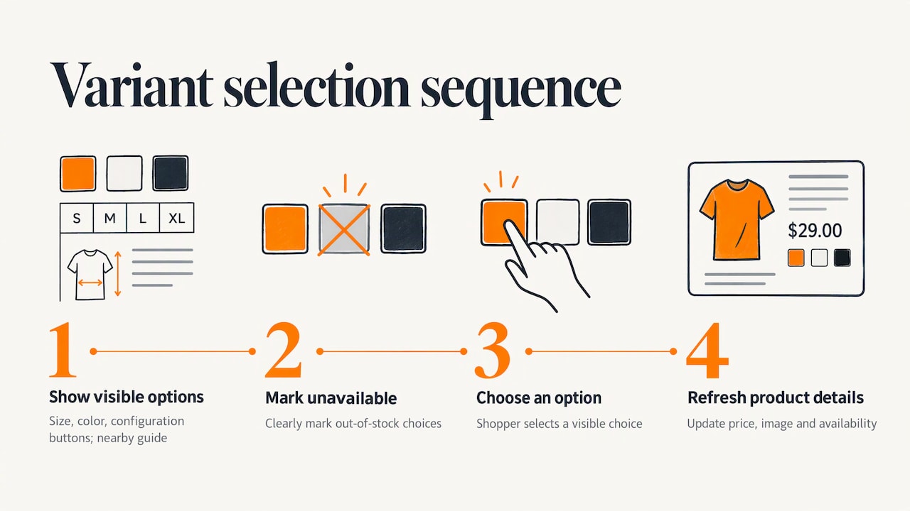
Size, color and configuration pickers are a common source of friction. Baymard found that 57% of sites fail to use button-style selectors for size, hiding the options in drop-down menus. The problem is that a shopper only discovers a size is out of stock after opening the menu and choosing it.
The better pattern is to show every option as a visible button or swatch, mark unavailable options clearly, and update the price, image and availability as soon as a choice is made. Link a size chart right beside the selector for apparel, or a compatibility guide for parts and equipment.
Reviews and social proof
Reviews answer the question your own copy cannot: what is it like for someone who bought it? Display the average rating near the top, and the full reviews below the description, with the ability to sort or filter them. Use real reviews only, and let customers submit photos where it makes sense.
Video testimonials are worth considering as well. WooCommerce’s guide notes they are especially effective because they remove doubt that a review was written by a bot or an AI tool.
How reviews are collected, moderated and displayed is a design problem as much as a content one. We cover it in detail in our guide to displaying customer reviews on your website.
Designing for the phone first
Most shoppers meet your product page on a phone, often by tapping a link from social media or an email. That argues for designing the small screen first and scaling up. In Shopify’s conversion guide, the author recommends keeping three things above the fold on mobile: what you are selling, what the customer gets, and how to get it.
Mobile rules worth building into the template:
- A buy button within thumb reach, large enough to tap without mistakes, and kept visible as the shopper scrolls.
- Swipeable image galleries with tap-to-zoom.
- Specs, reviews and shipping details in expandable sections.
- Form fields and selectors sized for fingers, not cursors.
Semrush’s roundup of product pages highlights REI’s mobile design for this approach: key information and the purchase action come first, while features, specs, reviews and Q&A sit in expandable sections and an add-to-cart bar stays on screen. You can see the pattern in the Semrush product page examples.
Speed is part of the design
Heavy galleries, video and review widgets all slow a page, and a slow page undermines every other decision above. Compress images, load media only when needed and keep third-party scripts lean. Our guide on improving ecommerce site speed without sacrificing the shopping experience walks through the trade-offs, and our Core Web Vitals guide explains the performance measures Google tracks.
Making the page findable
A beautiful page that nobody finds does not sell. Three basics apply to every product page.
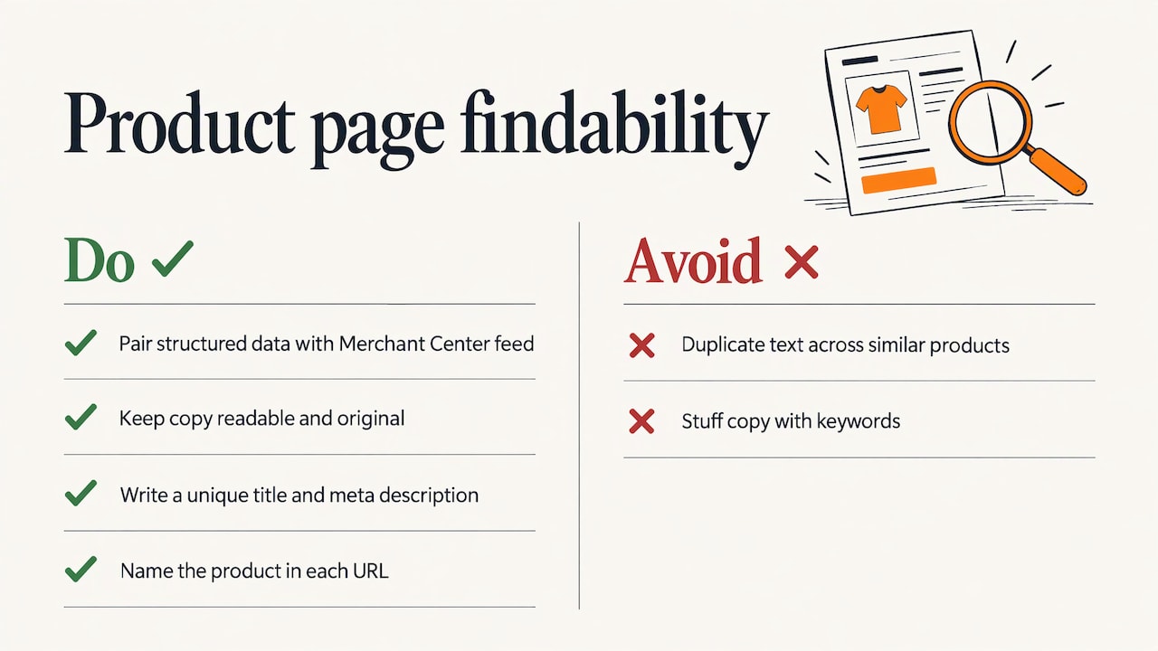
Structured data. Google recommends adding Product structured data to product pages, and pairing it with a Merchant Center feed to maximize eligibility. Product information can then appear in Search, Google Images and Google Lens, including price, availability, review ratings and shipping details.
Readable, original copy. Search Engine Land’s product page SEO guide advises keeping descriptions clean and easy to read, avoiding duplicated text across similar products, and avoiding keyword stuffing. The copy should convince people first.
Clear titles and URLs. Each page needs its own title, a unique meta description and a URL that names the product.
Site search is another way shoppers reach a product page, and it is worth designing deliberately. See our piece on site search for ecommerce. For the wider picture, our page on on-page SEO explains how these elements fit together.
Examples worth studying
The best way to learn is to look at pages that make specific choices well.
- Target puts key features in the headline and the video in the gallery with a play icon.
- Crutchfield gives the carousel more than half the page, shows clickable ratings near the top and places free shipping in the buy section.
- REI on mobile puts the essentials and purchase action first, with expandable detail sections and a sticky add-to-cart bar.
Baymard’s 18 UX design examples and its library of product page screenshots are good places to browse. When you do, copy the decisions, not the look: your catalog, buyers and brand are different from a national retailer’s.
A product page checklist
| Area | What to check |
|---|---|
| Name and price | Descriptive name, price and discounts visible at once |
| Images | Multiple angles, zoom, at least one in-scale image |
| Video | Inside the gallery, with a play icon |
| Description | Benefits first, full specifications below |
| Selectors | Buttons for size and variants, stock status visible |
| Buy button | High contrast, one primary action, space around it |
| Delivery and returns | Cost, timing and policy near the button |
| Reviews | Rating near the top, real reviews below |
| Mobile | Thumb-reach button, swipe gallery, expandable sections |
| Search | Product structured data, unique titles and descriptions |
Our perspective
We have been building websites for more than 38 years, and the lesson that holds across every industry is that a page works when it is designed around the person using it. A product page is the clearest test of that idea. The visitor arrives with a question, and every element either answers it or gets in the way.
What we see companies underestimate is that a product page is a template, a photography plan, a content plan and a technical build all at once. The design, the images, the copy, the speed and the search setup have to be decided together. That is why we bring web design, development, photography, video and SEO to the same project instead of treating them as separate jobs.
Our approach is tailored solutions, user-focused design and measurable results. For a manufacturer, that means pages that carry the technical detail a buyer needs. For a small business, it means a page that makes a modest catalog look as considered as a larger one.
Greg
Build your product pages with Marcy Design
If your product pages are not converting the way your products deserve, we can design and build the whole ecommerce experience: custom ecommerce web application, product photography, video, SEO and hosting, from a team that has earned more than 230 awards. Our guide to custom ecommerce for small business shows what a project involves.

To start the conversation, send us your details through the project intake form.
FAQ
How do you design a product page?
Start with what the buyer needs to decide: a clear name, price, availability, images and a single buy button. Then add the description, specifications, reviews and shipping information below. Build the template for mobile first and test it with your most and least documented products.
What should a product page look like?
On desktop, images sit on one side and the buying information on the other, with the button prominent and uncluttered. On a phone, the page stacks into one column with the image gallery first, key details next and details in expandable sections.
How do you do SEO for a product page?
Make sure the page can be crawled and indexed, give it a unique title, description and descriptive URL, and write original copy. Add Product structured data so Google can read price, availability and ratings, as described in Google’s documentation.
What is the most important element on a product page?
The call to action. Everything else, from images to reviews, exists to give the shopper enough confidence to press it. Make it high contrast, give it space and keep it visible, especially on mobile.
Sources
- Nielsen Norman Group: Ecommerce UX Product Pages
- Baymard Institute: Product Page UX Best Practices 2026
- Baymard Institute: 1677 Product Page Design Examples
- Baymard Institute: 18 UX Design Examples
- Google Search Central: Intro to Product Structured Data
- Search Engine Land: Product page SEO guide
- Shopify: Ecommerce Product Page Optimization
- Shopify: Ecommerce Conversion Optimization for Product Pages
- WooCommerce: How to Create a Winning Product Page Design
- Semrush: Ecommerce Product Page Examples