
 614.224.6226
A well-designed B2B case study does one job: it lets a prospect see a company like theirs, with a problem like theirs, reach a result they want. The layout that does this follows a story arc (customer, challenge, solution, results), puts the key numbers at the top, uses real quotes, and is built as a designed page rather than a Word document saved as a PDF. This guide covers the layout, the order of sections, the word counts, and the design details that make a case study convincing.
It is written for business owners and marketing leads, at small businesses, manufacturers, nonprofits and growing companies, who want customer stories that sell. It is not about academic case study research, which is a different discipline with different rules.
TL;DR
- Lead with the result. Put a short “results at a glance” block with two or three numbers at the top, then tell the story.
- Follow a clear arc: who the customer is, what went wrong, what you did, what changed. Most B2B case studies run about 800 to 1,200 words.
- Design for scanning: a customer fact row, pull quotes, one or two visuals, and a single next step.
- Specific beats impressive. Exact numbers, a time frame and a named customer champion build more trust than adjectives.
- Treat the case study as a page and an asset family: a web page, a one-page PDF, a quote graphic and a short video can all come from one interview.
Table of Contents
- What case study design means for a B2B business
- Start with the story arc
- The section-by-section layout
- Design details that make the page work
- How to run the interview and gather evidence
- What the best examples teach
- Common design mistakes
- Our perspective
- Have us build your case studies
- FAQ
- Sources
What case study design means for a B2B business
Search for this phrase and you mostly find research methodology: how academics define a bounded case and analyze it. That is not what a business owner needs. In marketing, case study design means two things together: the structure of the story and the visual layout of the page that carries it.
The goal is conversion. ScaleVP describes a strong B2B case study as one that balances narrative and data, with a clear strategic focus on the customers you want more of, a before-and-after arc with a customer champion, quantified outcomes, high-quality media and design, and assets you can reuse. G2’s guide adds a warning worth remembering: a poor layout can deter readers even when the story underneath is excellent.
That last point is why design matters. A prospect arrives at a case study mid-decision, often forwarded by a salesperson, and spends seconds deciding whether to keep reading. The layout has to answer “is this about someone like me?” before the first paragraph is finished.
Start with the story arc
Every format that works rests on the same bones. Shopify’s case study guide describes a simple arc of customer context, problem, solution and result. Zapier’s interview with journalist Erik Sherman explains why it works: the formula has the structure of a real story, with a conflict, a protagonist and a resolution, and in telling it you deliver what the reader wants.
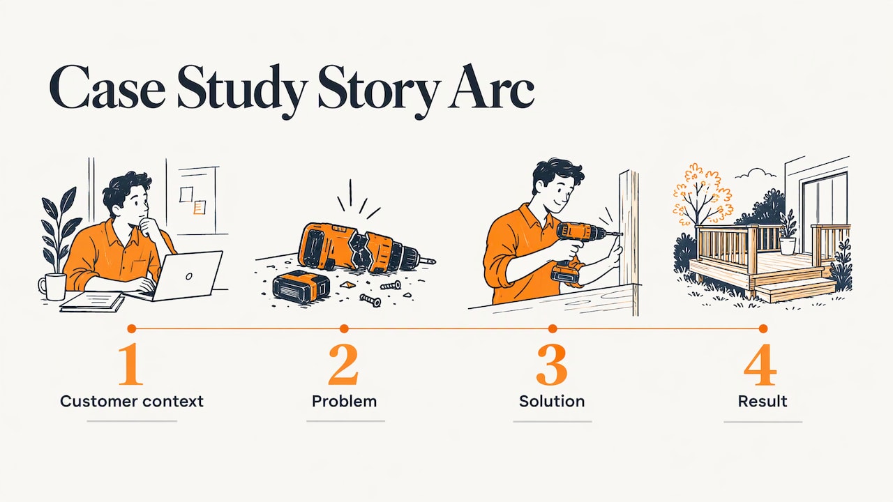
Your customer is the protagonist, not you. Your product or service shows up as the tool that resolved the conflict. Case studies that open with your company history, or that read like a press release, lose the reader at the first line.
Pick one reader before you pick a layout
A case study aimed at everyone persuades no one. Decide which kind of buyer the page is for: a manufacturer weighing an ecommerce build, a nonprofit replacing an outdated site, a small business owner who needs leads. Melanie Deziel, quoted in MarketingProfs, says readers should see a situation, organization or challenge similar to their own. Even when a customer will not let you use their name, a specific descriptor does the work. Her example is a mid-size bank in Arizona facing a particular scenario.
The section-by-section layout
The sources differ in names but agree on order. Here is a layout that combines them, with a target length for each part. These budgets follow the 50 to 300 word ranges in G2’s summary of a seven-section template and keep the whole piece near the 800 to 1,200 words that AWAI reports as typical.
| Section | What it contains | Target length |
|---|---|---|
| Title and subtitle | Customer, problem or result, in one line | 8 to 15 words |
| Results at a glance | Two or three headline numbers with time frame | 30 to 50 words |
| Customer fact row | Industry, size, location, what they sell | 20 to 40 words |
| Challenge | The problem and what was at stake, with a quote | 150 to 250 words |
| Solution | The decision, the work, the surprises | 200 to 300 words |
| Results | Numbers, baseline, measurement period, second quote | 100 to 200 words |
| Next step | One clear action | 1 to 2 sentences |
The title and subtitle
Shopify’s guide recommends leading the title with the customer, the problem or the result. “How a Central Ohio Manufacturer Doubled Quote Requests in Six Months” tells the reader more than “Customer Success Story: Acme Co.” The subtitle can carry the method in a single clause.
Results at a glance
ScaleVP advises placing a results-at-a-glance box at the top rather than burying the facts. G2’s template does the same with an executive summary holding two or three success-metric bullets. Busy buyers read this block and decide whether to continue. Make each figure concrete, with a time frame: revenue impact, hours saved, conversion increase, cost reduction.
The customer fact row
A strip near the top listing industry, company size, location and what the customer sells does a surprising amount of work. Raccoon Page’s guide argues it is the reader’s first check, the “is this me?” test, and that a stranger should be able to sort “like me” from “not like me” in about seven seconds. This is also where you can show the reader that the customer resembles them, even without a logo.
The challenge
State the problem plainly. MarketingProfs lists what a strong case study leaves no ambiguity about: who was helped, what was at stake, when and where it happened, and how the product or service benefited the company. A customer quote here is the strongest element, because the reader hears the pain in the customer’s words, not yours.
The journey and the solution
Copywriter Slaunwhite, speaking to Zapier, says the journey section, where the customer researched and compared options, is where the reader begins to identify and empathize. The solution section is where you can describe your work freely without sounding promotional. Cover the decision, the rollout and the obstacles. Honest friction (a delayed integration, a change of scope) makes the story credible. Testimonial.to’s guide makes the same point: the best stories show the setup, the friction, the adoption path and the proof.
The results
This is the section buyers screenshot. Use exact numbers. MarketingProfs gives the model: “increased subscriptions from 60 to 125 per month” says more than “doubled growth.” Give the baseline, the measurement period and the source of the data. Close with a second quote, ideally about the outcome rather than the process.
If the customer will not let you publish any numbers, Raccoon Page puts it bluntly: you have a testimonial in a fancy outfit. Settle permission for the figures before the interview, not after the draft.
The next step
One call to action, relevant to the story: book a consultation, request a proposal, see a related project. Not four.
Design details that make the page work
Structure gets the content in order. Visual design makes it readable in the seconds a prospect gives it.
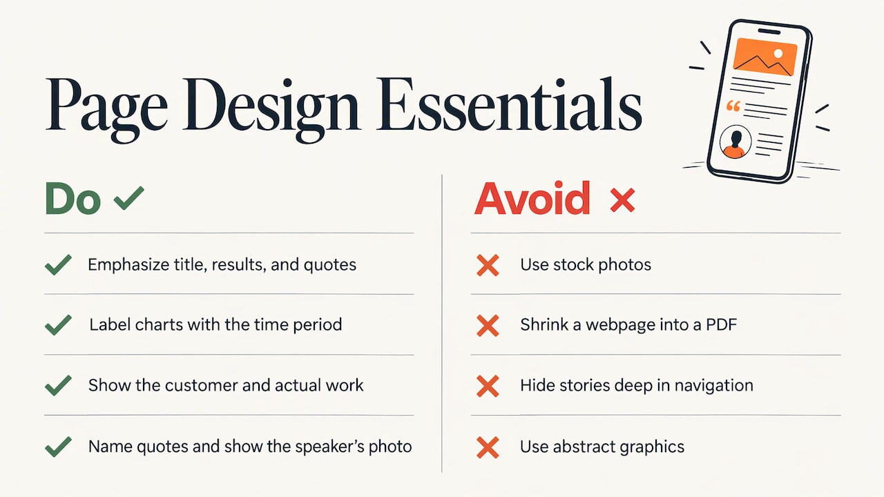
Hierarchy. The title, the results block and the pull quotes should be the largest or most distinct elements. A reader who only scans those three should still get the story.
Numbers as visuals. Turn the two or three best figures into large callouts. MarketingProfs recommends percentages, charts and graphs alongside the text. Keep chart labels simple and always show the time period.
Real people and real work. Use at least one photograph of the customer or their team, plus images of the actual product, site or facility. Stock photos undercut a page whose entire value is that it is true. Screenshots, before-and-after comparisons and short video clips are all stronger than abstract graphics.
Quotes that sit in the layout. Set quotes apart with the person’s name, title and photo. Raccoon Page recommends two or three named quotes. A quote from an executive about the business result and one from a day-to-day user about the process cover both buyers.
Mobile first. Prospects open forwarded links on phones. Fact rows, results blocks and tables must stack cleanly, and any PDF version should be a true one-pager, not a shrunken web page.
Where it lives. Deziel warns that a hidden, deeply nested page of customer stories will not be found. Give case studies a visible home in the main navigation, link them from service pages, and place the relevant story near the point where a visitor is deciding.
How to run the interview and gather evidence
A case study is only as good as the material you collect. A practical sequence:
- Choose the customer deliberately. Pick one that matches the buyers you want more of, with a result you can measure.
- Agree on permissions early. Confirm name, logo, quotes, photos and the right to publish numbers in writing.
- Capture the baseline. Record the starting figures before the project begins, such as monthly leads, conversion rate or order volume. After the fact, the “before” is hard to reconstruct.
- Interview for the story, not the praise. Ask what the problem looked like day to day, what they tried, why they chose you, what surprised them and what changed. Ask for specifics: how many, how long, how much.
- Draft in the arc, then cut. Write to the section budgets above. Send the draft to the customer for approval.
- Package once, use many times. One interview can produce a web page, a one-page PDF, a social quote graphic, a sales email excerpt and a short video clip. ScaleVP calls this repurposable assets, and the Testimonial.to guide describes the same pattern of a quote, a long-form study, a video clip and a sales-ready version.
This is a lot of work across writing, photography, design and video, which is why many companies hand it to one team rather than coordinating four vendors. Our professional writing, photography and video production services cover those pieces, and our guide to evaluating marketing case studies explains how buyers read the proof you publish.
What the best examples teach
G2 points to well-known B2B stories such as AWS’s Thomson Reuters cloud project and Salesforce’s Pepe Jeans ecommerce story. You do not need an enterprise budget to borrow their design logic:
- Organize by buyer. Testimonial.to observes that HubSpot’s content hub sorts stories by industry, use case and product line, so sales can pull the right proof at the right moment. A manufacturer with three markets should tag stories the same way.
- Go deeper than a quote. The same guide notes that Salesforce’s advisory-board customers speak to executive alignment, procurement hurdles and internal adoption. Those details make a story more believable than a one-line endorsement.
- Avoid the trophy cabinet. Testimonial.to warns that a hub where every story reads like a press release becomes decorative, not persuasive. If your stories could be swapped between any two customers, they are too generic.
A smaller company can apply all three. Ten tidy stories sorted by industry and service beat fifty undifferentiated logos.
Common design mistakes
- A wall of text with no entry points. No results box, no subheads, no pull quotes.
- A vague hero line. “Delivering excellence” tells the reader nothing. Lead with the customer and the outcome.
- Claims without baselines. “Increased traffic significantly” invites doubt. State from what, to what, over how long.
- No customer voice. Without a named quote, the page reads like your own advertising.
- A story that is really a product tour. The customer’s problem should take more space than your feature list.
- Several competing calls to action. One next step, placed after the results.
- A PDF-only format. Locked-away files cannot be found by search or linked from service pages.
Our perspective
A case study is the one page on your site that a buyer reads with their guard down, because it is about someone else. That is exactly why it has to be built with care.
We have spent more than 38 years designing websites and marketing for companies across industries, and the pattern is consistent: a proposal gets a prospect curious, and proof gets them to sign. Proof that is hard to read, hard to find or short on specifics does not do its job.
That is why we treat a case study as a design project, not a writing exercise. The story, the numbers, the photography and the page layout have to work together. The customer fact row, the results block and the quote treatment are design decisions as much as editorial ones, and they decide whether a skimming prospect stays.
It also helps to have one team handle the whole chain: interview and writing, photography, video, the web page and the follow-through into search and lead generation. Our focus on tailored solutions, user-focused design and measurable business results applies to your proof as much as to your website.
Greg
Have us build your case studies
If you have customer wins but no polished way to show them, we can turn them into pages that sell. Our team handles website design so your case studies have a clear home and a layout built for scanning, along with professional writing, creative photography and video production for the story itself. We also build lead generation programs that put those stories in front of the buyers you want.
To talk through which of your projects would make the strongest case study, book a free consultation.
FAQ
What should a B2B case study include?
At minimum: a title that names the customer and result, a short results summary, a customer profile, the challenge, the solution, measurable results and a next step. G2’s template also calls for testimonials and one or two supporting visuals. Quotes from the customer should appear in the challenge and the results.
How long should a case study be?
Most B2B case studies run roughly 800 to 1,200 words, about the length of a short blog post, according to AWAI. Shorter is fine if the numbers and quotes are strong. A one-page PDF version should cut to the results block, one quote and the key facts.
What is the best layout for a case study?
Put the results and customer fact row at the top, then follow the story in order: challenge, solution, results, next step. This lets skimmers get the point at once and lets committed readers follow the narrative. Keep paragraphs short and use pull quotes and visuals to break up the text.
Do I need the customer’s name and numbers?
Names are better, and numbers are essential. If a customer will not be named, describe them specifically, by industry, size and region, so readers still recognize their own situation. Without publishable results, the page is a testimonial rather than a case study, so agree on figures before you start.
Where should case studies live on my website?
In plain view. A hidden sub-page of success stories will not be found, as Melanie Deziel notes. Add a case studies link to your main navigation and place relevant stories on the service pages where buyers are deciding.
Sources
- Building a great B2B case study, ScaleVP
- What Is a Case Study? How to Write, Examples, and Template, G2
- 10 Real-Life Case Study Examples + Free Template, Shopify
- How experts write case studies that convert, not bore, Zapier
- How to write a case study customers will let you ship, Raccoon Page
- 6 Elements of Effective B2B Case Studies, MarketingProfs
- Melanie Deziel on B2B Case Studies, Proof, and Customer Stories, MarketingProfs
- How to Write a Case Study for B2B Companies, AWAI
- Top Implementation Success Stories, Testimonial.to